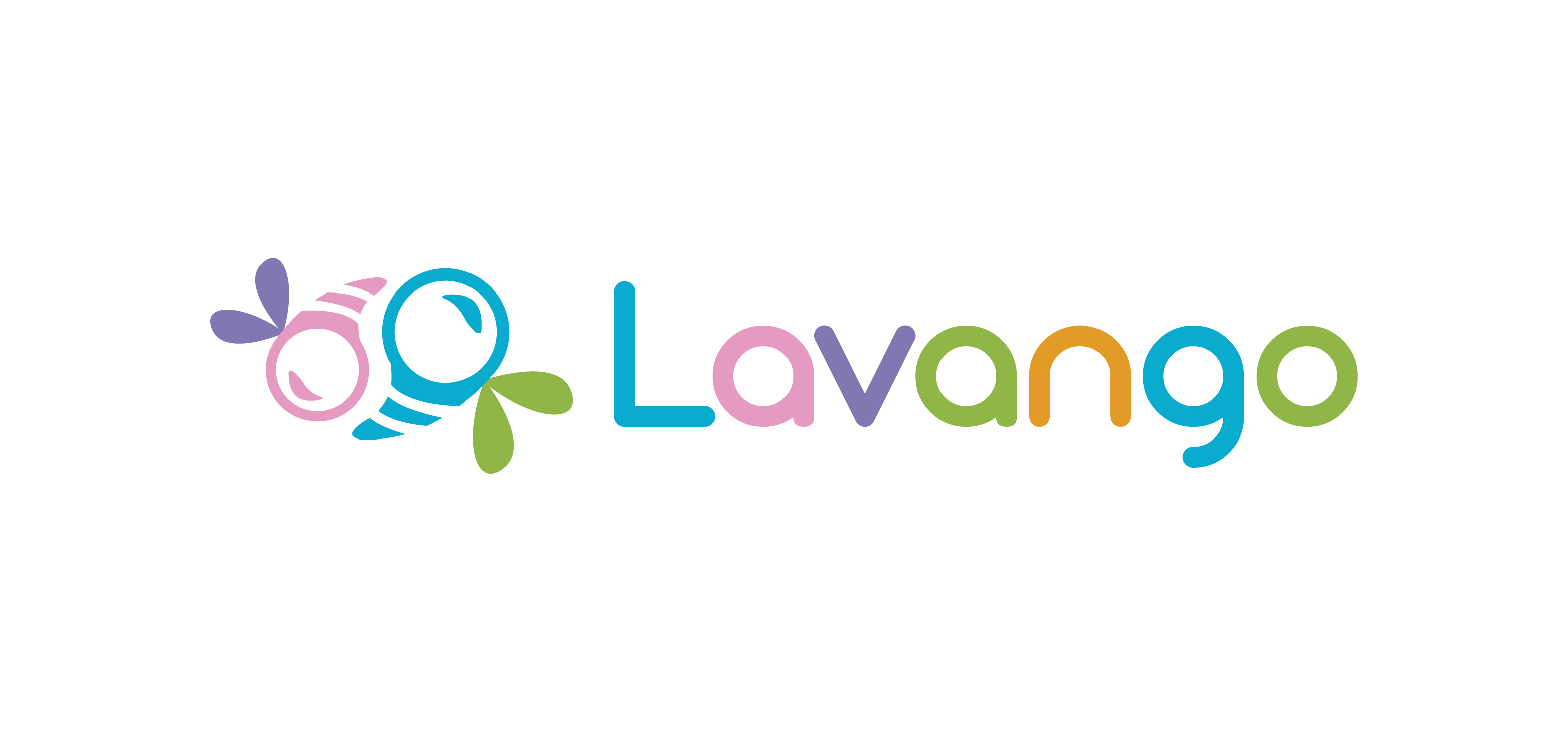
I explored ideas that could symbolize both freshness and life, which led to a bee inspired illustration. The bee connects naturally to fragrance and flowers and it also ties back to nature. Its motion forms a swirl, hinting at a washing machine in action. This helped anchor the concept to the product without being too literal.
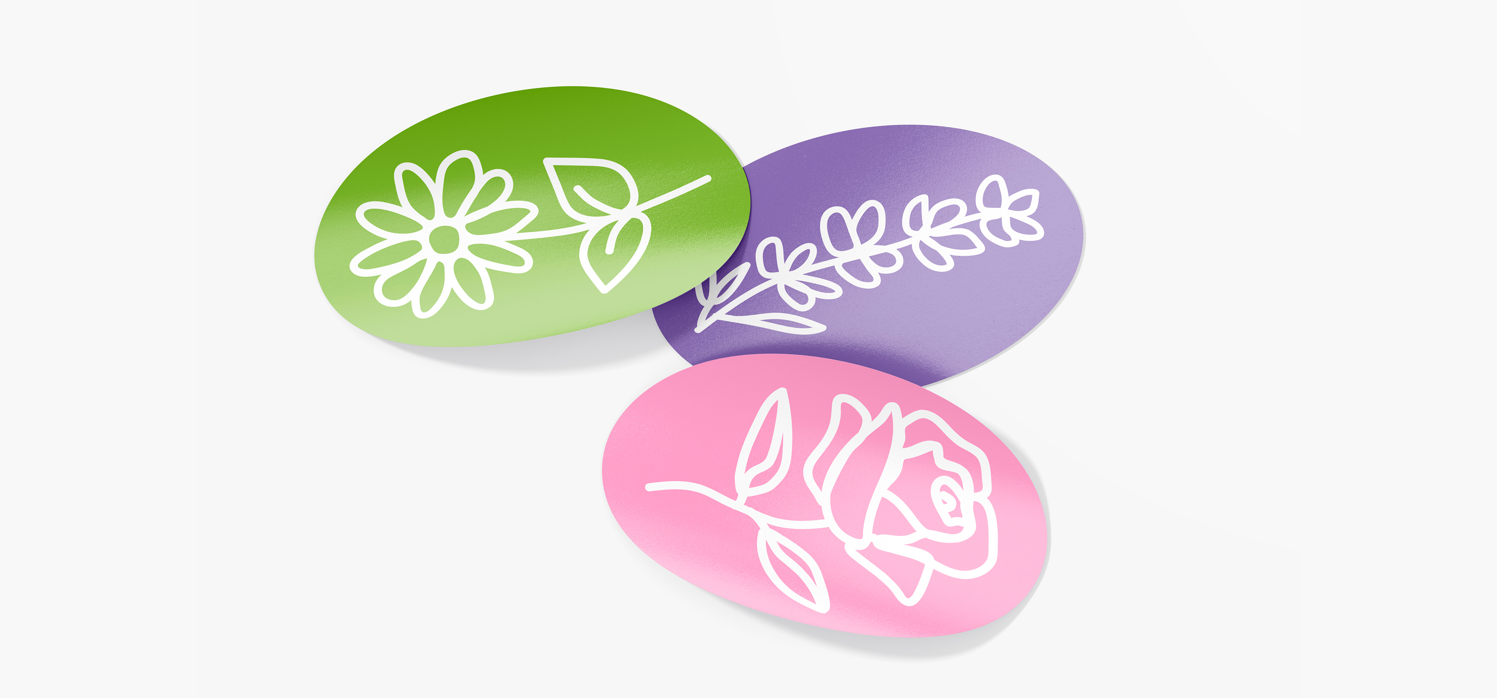
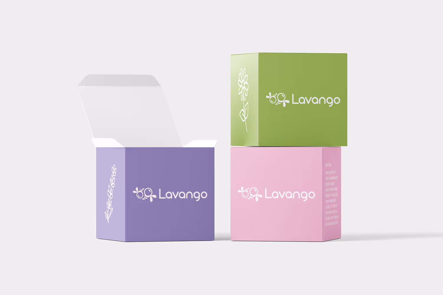
The final identity uses a bright and colorful palette that represents the different product variants and gives the brand a cheerful, approachable tone. Once the logo system was finalized, I applied it to the packaging design to create a consistent look that stands out on shelves and feels fresh and modern.